PEGASUS

AUTO AND AIRCRAFT DETAILING

YEAR

2026

ACTIVITY

BRAND DESIGN
PRINT DESIGN
WEB DESIGN

INDUSTRY

VEHICLE
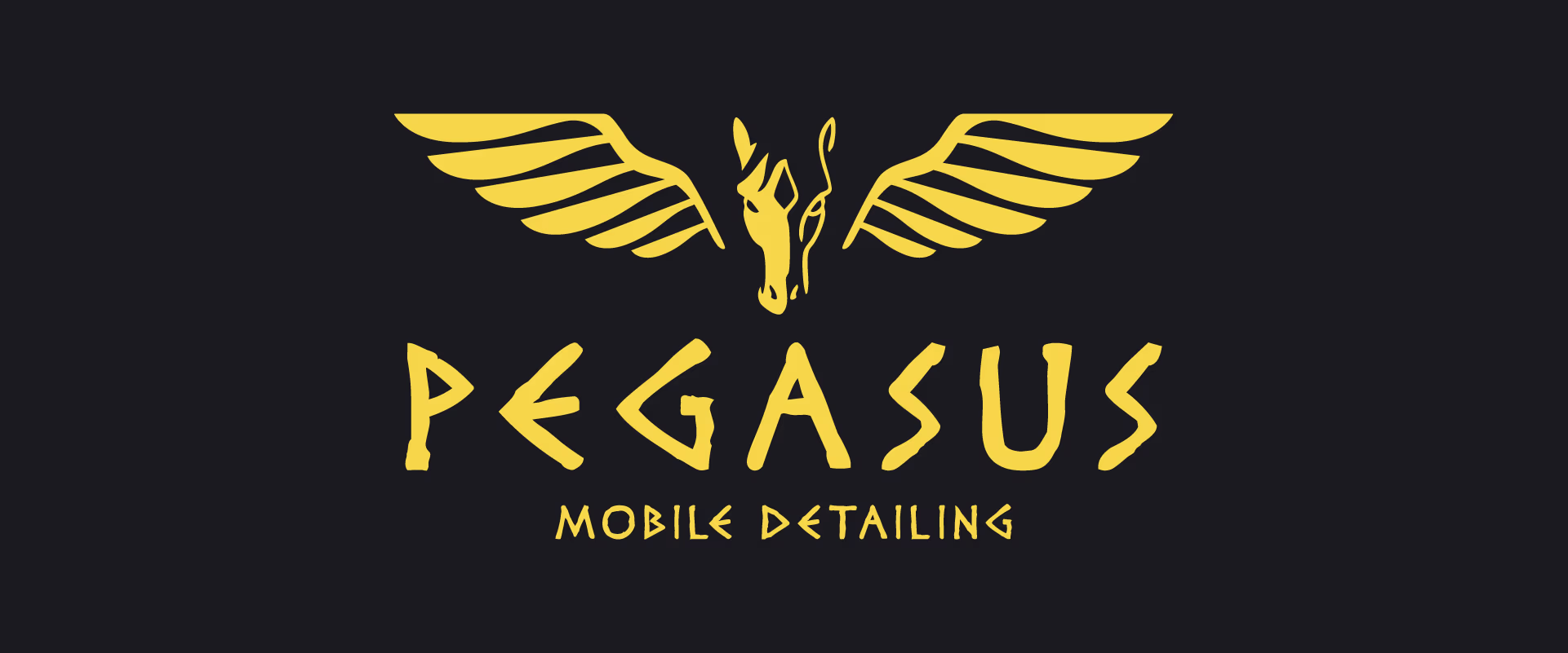
Yellow Pegasus logo with wings and text 'PEGASUS MOBILE DETAILING' on a dark background.

CONTEXT

CONTEXT

Pegasus Mobile Detailing is an established car detailing business expanding its services into the aircraft detailing industry. The goal of this project was to reposition the brand to support this expansion, improve overall visual consistency, and elevate its perceived quality to align with a more premium audience. The engagement included a full brand refresh, refinement of the visual identity, and a complete redesign of the company’s website (built on Wix for operational continuity).

Objectives:
  • Strengthen the existing brand identity while maintaining recognition
  • Improve logo clarity, scalability, and usability across formats
  • Align the visual direction with a more premium market positioning
  • Prepare the brand for expansion into aircraft detailing services
  • Redesign the website to reflect the updated identity and improve user experience
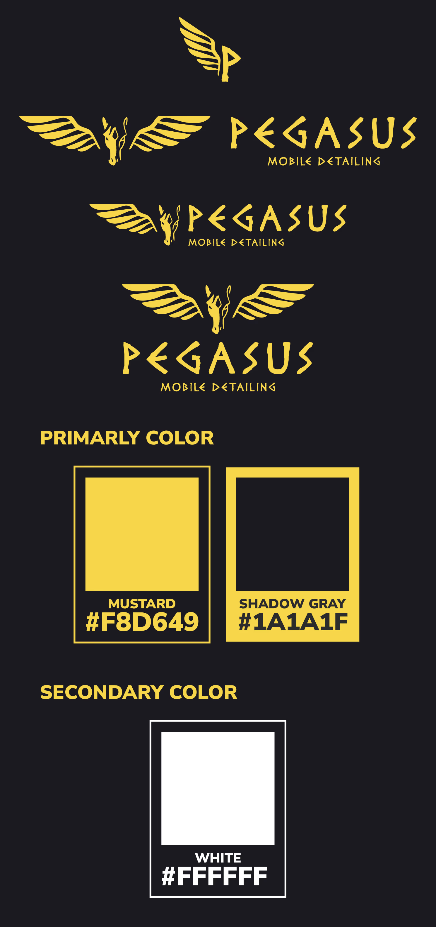
Three yellow Pegasus Mobile Detailing logos and color swatches mustard #F8D649, shadow gray #1A1A1F, white #FFFFFF.

DESIGN
DECISIONS

LOGO

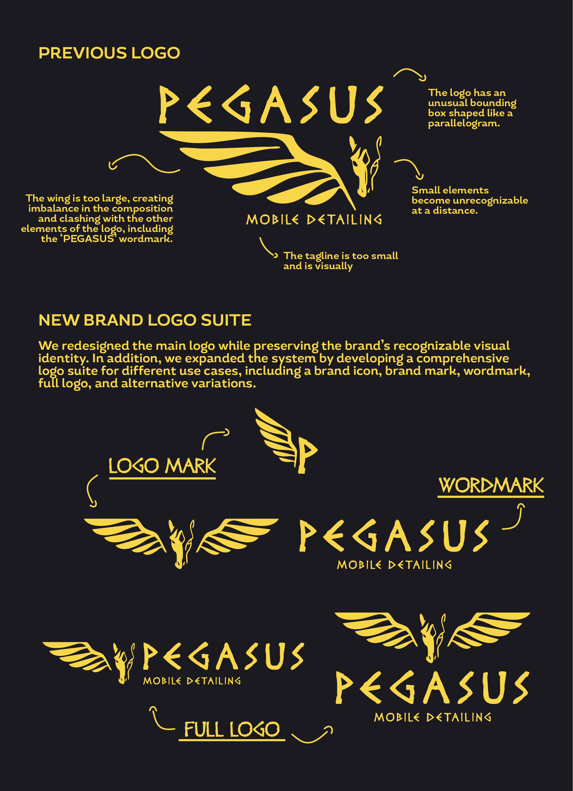
The original logo presented several issues related to scalability, readability, and balance. Certain elements became unclear at smaller sizes, while others dominated the composition and reduced overall legibility. To address this, the logo system was refined and expanded:
  • Simplified and optimized the original mark for better readability across sizes
  • Developed a secondary logo mark combining a “P” with a wing element to reinforce brand recognition
  • Created a mascot-style logo featuring a Pegasus with a more balanced composition and dual wings, used for more expressive branding applications
  • Introduced alternative logo variations to ensure flexibility across different use cases while maintaining brand consistency

The updated system improves clarity, adaptability, and visual cohesion across platforms
COLOR PALETTE

The original palette consisted of a bright yellow paired with pure black. While functional, it lacked depth and did not fully communicate a premium feel. The revised palette includes:
  • A shift from bright yellow to a more muted mustard gold tone
  • Replacement of pure black with a softer shadow gray

This adjustment helps establish a more refined and premium visual identity, aligning better with the brand’s positioning in high-value vehicle care.
Comparison of old and new Pegasus logos and brand elements with notes on design improvements.

GRAPHIC ELEMENTS

GRAPHIC ELEMENTS

A consistent set of graphic elements was introduced to support the identity across various applications:
  • Wing-inspired motifs used as subtle design accents and bullet point indicators
  • Linear stripe elements referencing motion, speed, and automotive aesthetics
  • Structured layouts that balance technical precision with a premium feel

These elements help reinforce brand recognition while maintaining visual consistency across print and digital materials.
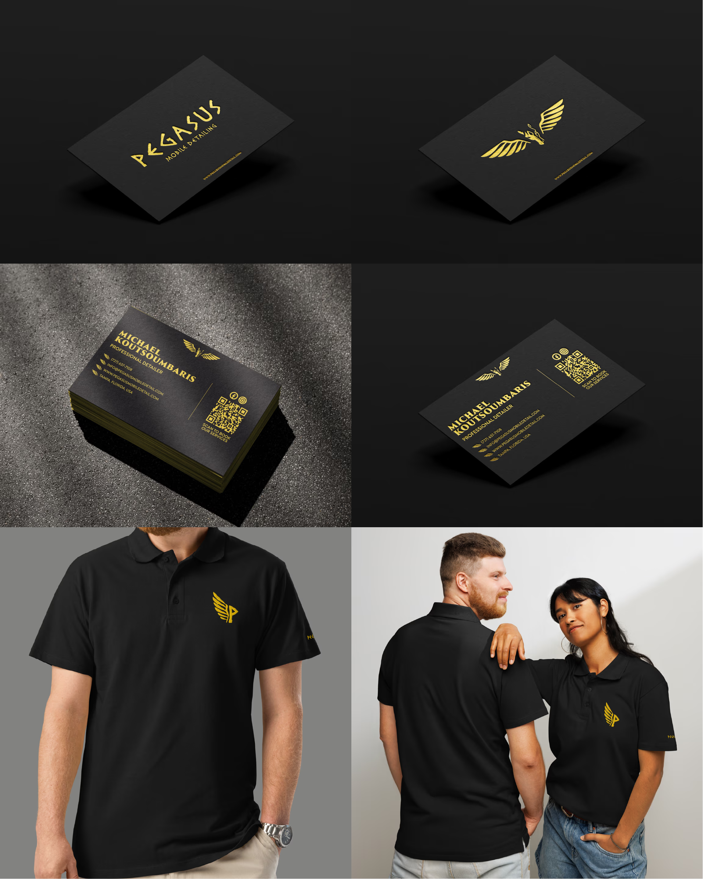
Pegaus assets , Business Card , Uniforms
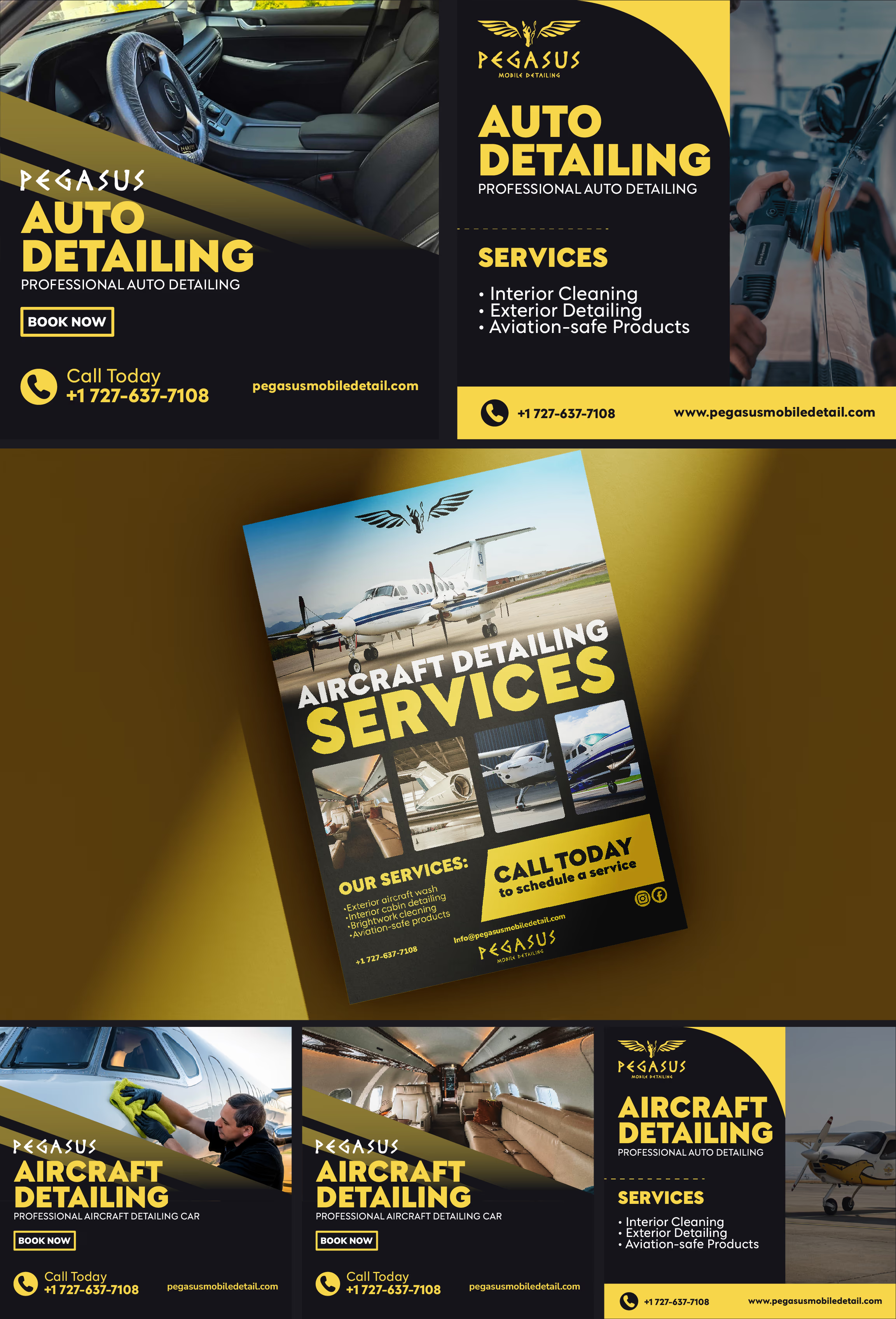
Pegasus mobile detailing ads featuring auto and aircraft cleaning services with contact info and images.

WEB DESIGN

WEB DESIGN

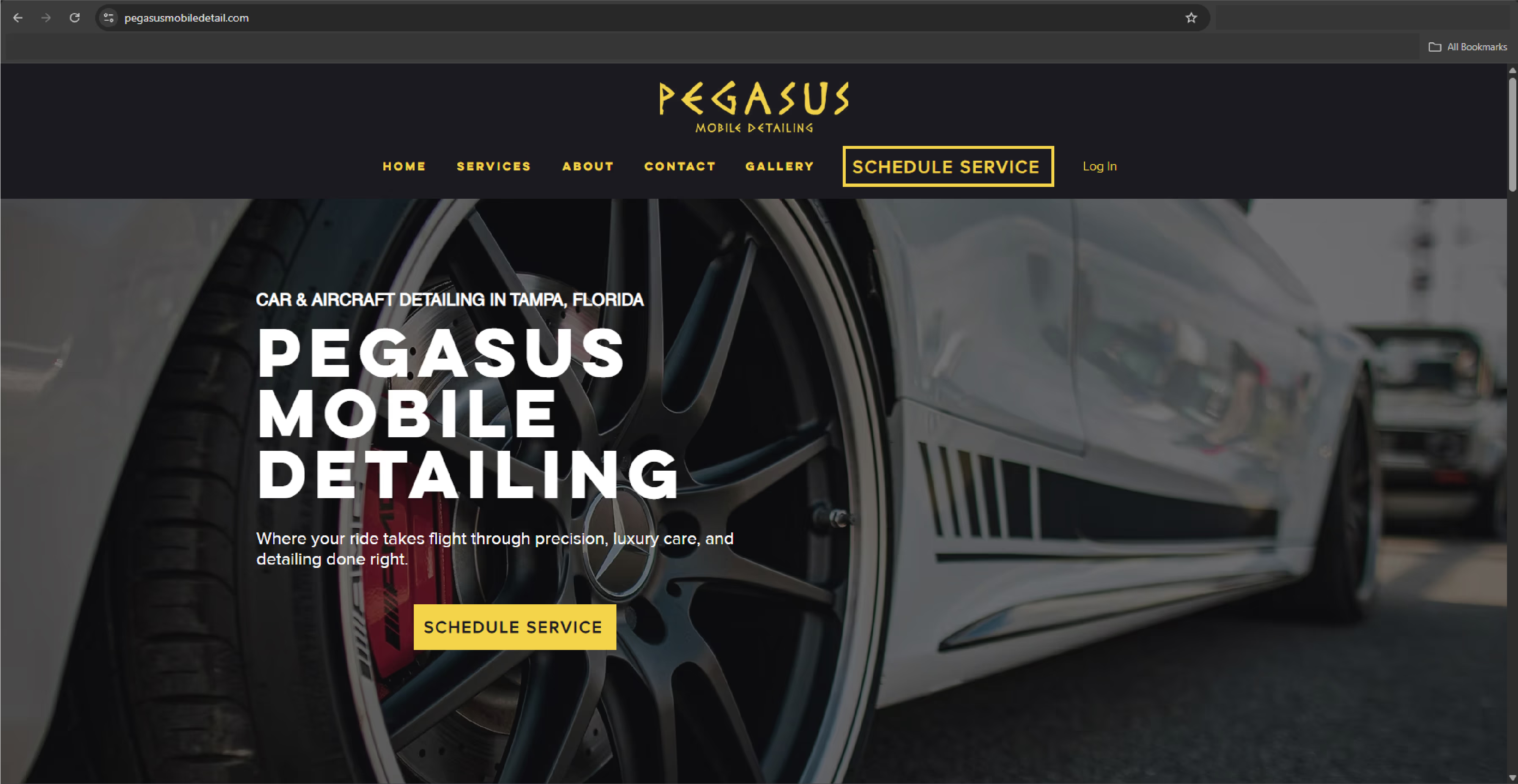
The website was originally built on Wix. To accommodate the client’s operational preferences, the redesign was implemented within the same platform while significantly improving visual quality and structure. Key improvements include:
  • A modernized layout aligned with the new brand identity
  • Clear presentation of services and offerings
  • Design considerations for future expansion into aircraft detailing services
  • Improved visual hierarchy and user flow for better usability

Despite platform limitations, the redesign achieves a more polished and premium digital presence.

To visit the website and see it for yourself, visit:
pegasusmobiledetail.com
or click the image below:
Pegasus Mobile Detailing Website