LOGO
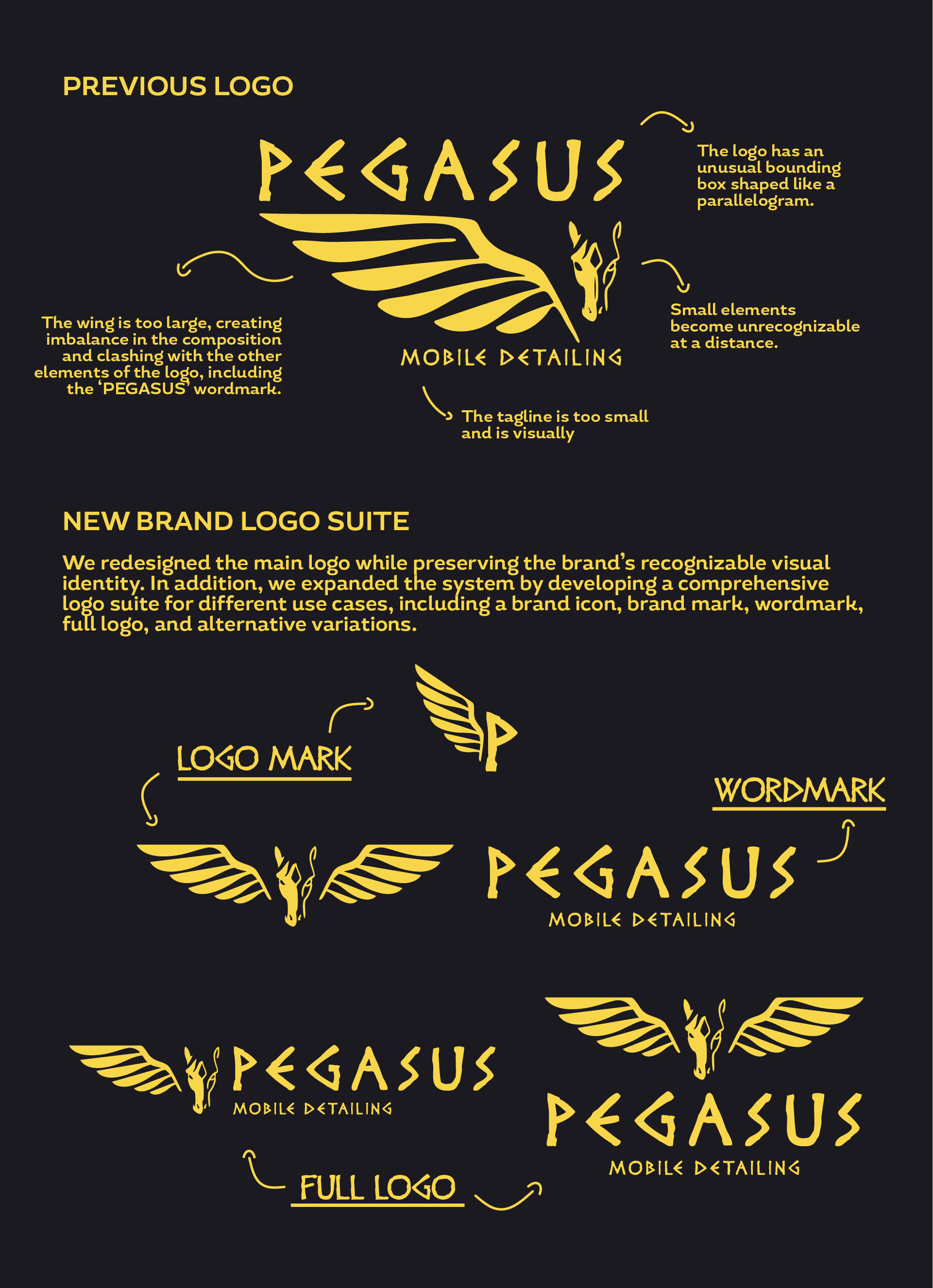
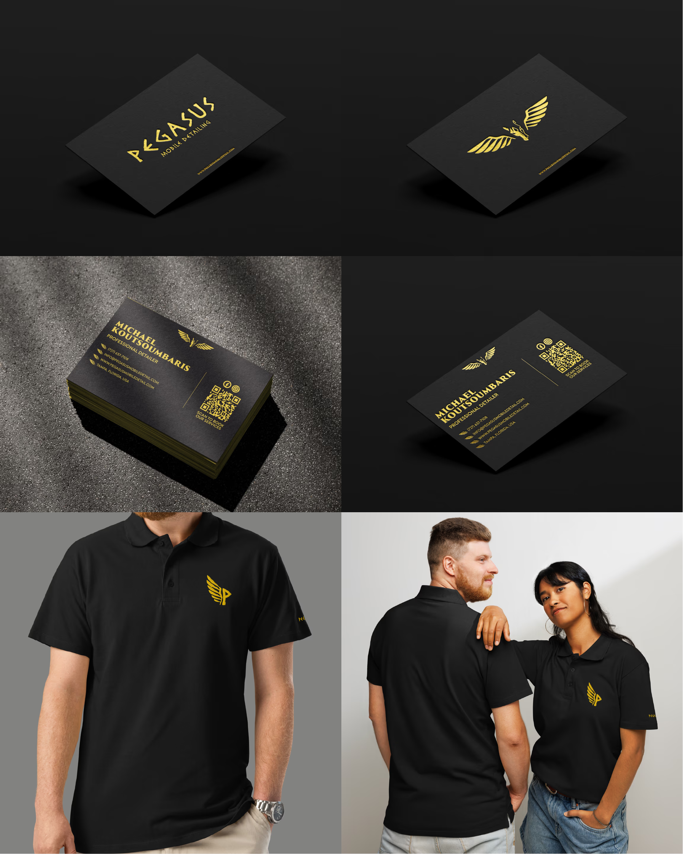
The original logo presented several issues related to scalability, readability, and balance. Certain elements became unclear at smaller sizes, while others dominated the composition and reduced overall legibility. To address this, the logo system was refined and expanded:
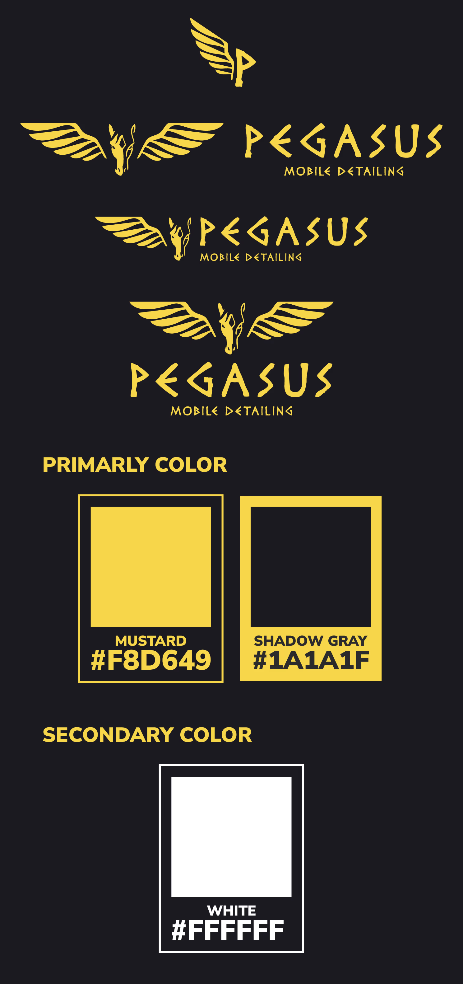
- Simplified and optimized the original mark for better readability across sizes
- Developed a secondary logo mark combining a “P” with a wing element to reinforce brand recognition
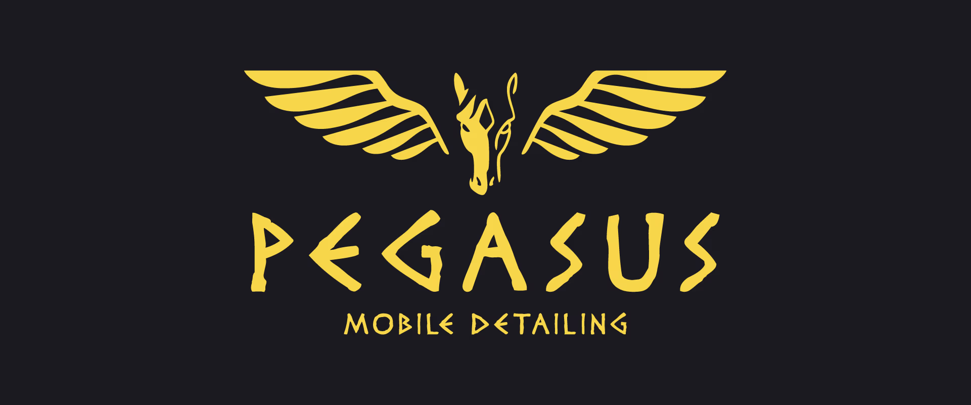
- Created a mascot-style logo featuring a Pegasus with a more balanced composition and dual wings, used for more expressive branding applications
- Introduced alternative logo variations to ensure flexibility across different use cases while maintaining brand consistency
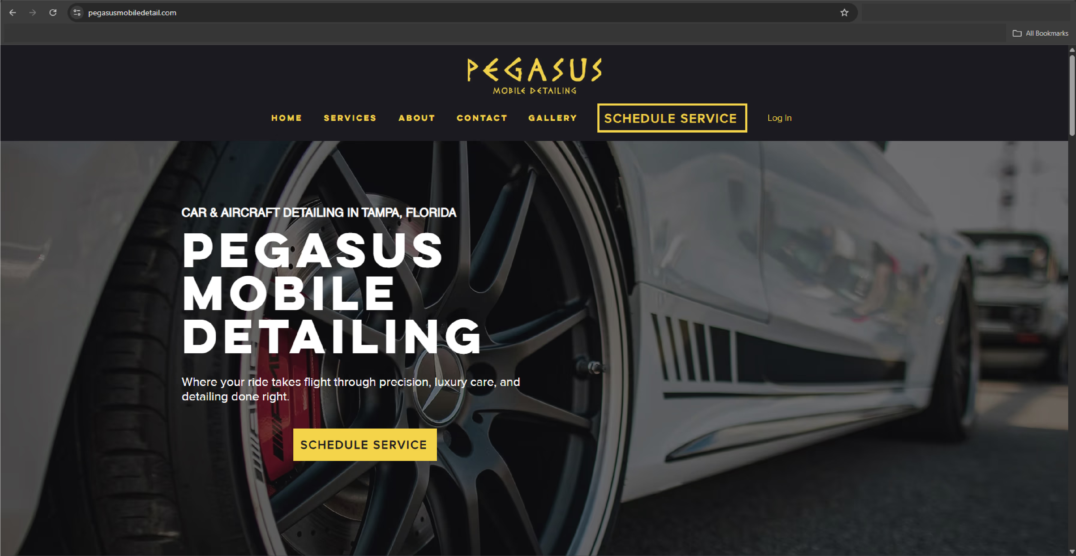
The updated system improves clarity, adaptability, and visual cohesion across platforms